UPTU Website “www.uptu.ac.in” gets a all new Look
One of the India’s Prestigious University Uttar Pradesh Technical University, Lucknow formely known as UPTU ahs redesigned its website www.uptu.ac.in. The Website got a new Look & updated on 30th June 2015 & Finally Completed on 1st July 2015 which is Now live on UPTU Official Website. Earlier UPTU has its Two Function in Uttar Pradesh as GBTU & MTU but now both GBTU & MTU merged into UPTU again.
UPTU official website & its Online Portal is always been in Countroversies Many students of UPTU said that the University has the worst website & their Server they can’t handle a Small traffic, They can’t even Upload results, Exam Schedule, Attendance etc on the given time. One of the Student said the website looks ugly & irritating but now the Whole UPTU website is now Revamped & gets its all new Look. There was a news that one of the students Hacked UPTU official website www.uptu.ac.in & can access the complete database of the university & can make changes to them.
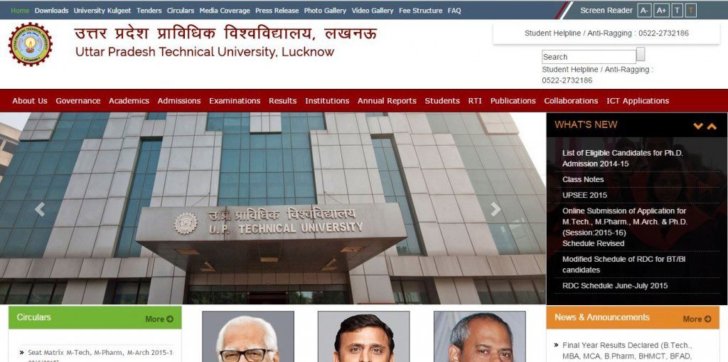
The UPTU Official website got a Parallax type Theme witha slider Image & lots of Information & content Available in a Single Window with Given permalinks in which students can get the information just on a single Click. it seems like From Narendra Modi Digital India Campaign UPTU this time take this seriously & Changing its Level & Class of University. Also, This Year Recently in May 2015 UPTu got its New Vice Chancellor Prof. Omkar Singh. As the Previous Vice Chancellor Prof. R.K Khandal Resigned due to some Reasons.
Lets Review & Talk about the UPTU Website.
- The Website has Two Menu i.e Primary menu & Secondary Menu
- A Screen Reader to Change Size & color of the Text in the webpage – “If you are Lucky, it will Definitely Work”
- Parallax Type Theme
- What’s New Section Added
- News & Announcement Section Added on the either side which attracts its visitor.
- A Slider Image of UPTU Buildings & other Pictures – For Showoff Purpose
- Management Photos – “A Must, Without this website would be incomplete”
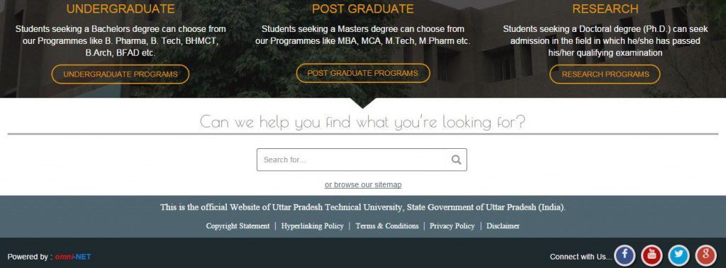
- Courses Details – “how to ruined your career” :p 😉
- Search Bar – Not Working Anymore 🙂
- Footer with Social media Icons & Quick Links – (UPTU is not available officially on any Social media Network, the Links of facebook, twitter, youtube, G+ is just for the showoff & doesn’t work at all.
- UPTU Website is developed in asp.net & HTML Framework
- You need to Zoom In & Zoom Out to Access in Mobile Phone/Smart Phones – “Not that Responsive Site”
- The website is developed by Omni-NET & NIC (National Informatics Centre)
Here is How the First Home page Look like.

UPTU Also Removed its Previous Permalinks & made few Changes to the Entire Data Structure & Directory of the website & trying to Provide Information to the visitor on single Page to access what he/she is looking for. The Website looks cool & Better than the Previous.
Well, we Hope UPTU Keep it up & Change its entire System & change the Education System of the University. every time there is News of leaked papers, Answer sheet found at Scrap shop, Corruption in UPTU, Fee Controversy etc.
How Did you like the new website of UPTU & What changes you wanna see in the University? Tell us in comments below.
EDIT: Meanwhile, UPTU Removed the Social Icons & Search bar as shown in above picture. Dated- 03/07/2015


